This is a structured exercise from the Harisenin UI/UX & PM bootcamp (Basic Mission 4) — the method (Nielsen's heuristics) and the target app are set by the program. Shown here as evidence of the method, not a finished usability study.
01Context
The brief: pick a live app and walk it against Jakob Nielsen's 10 usability heuristics, citing one concrete example from the app for each principle.
02The walkthrough
| # | Heuristic | Found in Maxim |
|---|---|---|
| 1 | Visibility of system status | A loading indicator on app open and on every page transition. |
| 2 | Match between system & the real world | The motorbike icon follows the actual route on the map; a wallet-and-phone visual for e-wallet payment. |
| 3 | User control & freedom | A Cancel button for orders, an Edit Destination option, and adjustable tip/compensation toggles. |
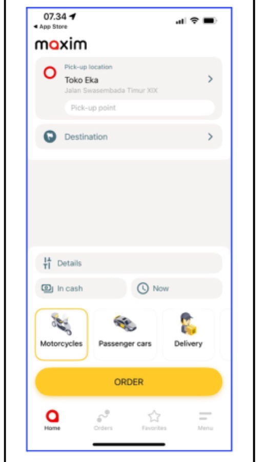
| 4 | Consistency & standards | Uniform icon style and labels across Motorcycles / Cars / Delivery; standard "Pick-up" / "Destination" terms. |
| 5 | Error prevention | A confirmation pop-up before deleting an account or a saved address, with clear Yes/No options. |
| 6 | Recognition over recall | Search-term suggestions while typing; a recognizable red home icon in the bottom nav. |
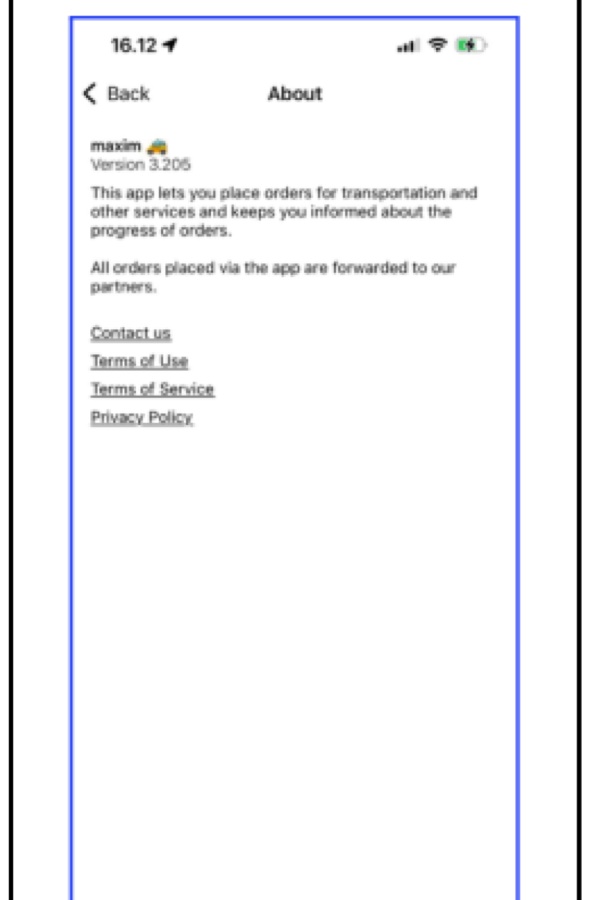
| 7 | Flexibility & efficiency of use | Direct hyperlinks to Contact Us, Terms of Use, and Privacy Policy for experienced users. |
| 8 | Aesthetic & minimalist design | A clean layout: logo, pick-up/destination fields, service icons, and one primary "Order" button. |
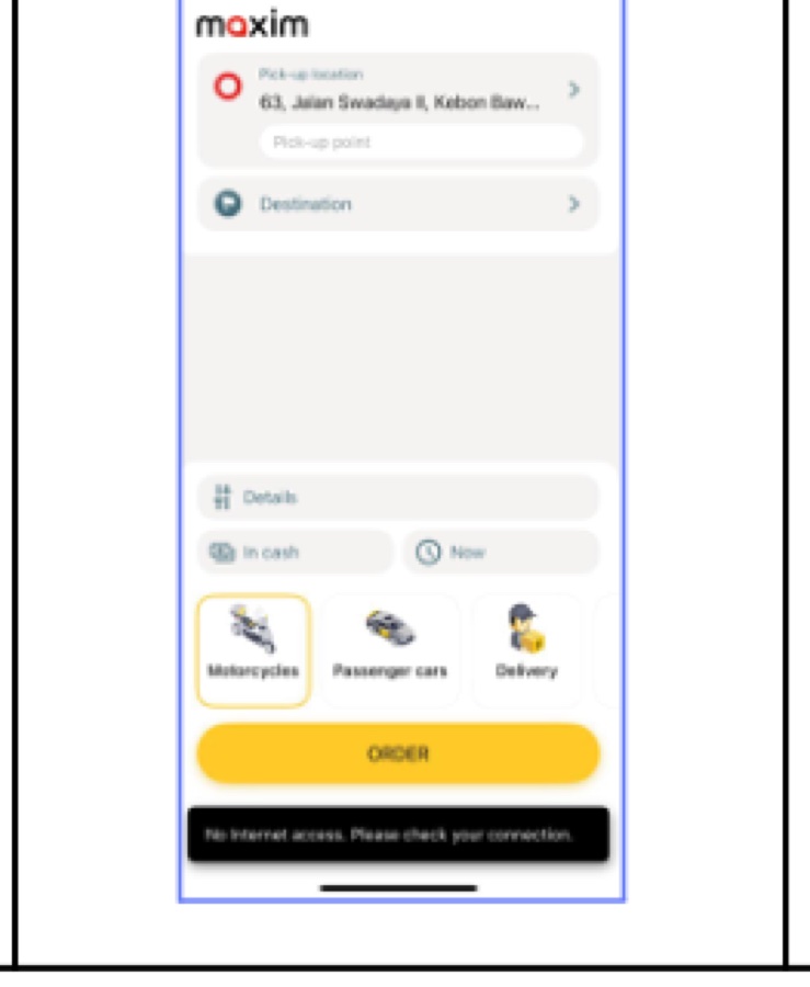
| 9 | Help users recognize & recover from errors | Plain-language messages — "Please specify a valid address," "Please login" with a Proceed button. |
| 10 | Help & documentation | An in-context explainer on the SOS button; a Help Center with Contact Us and FAQ links. |
03A note on what this actually shows
Every principle came back clean in this pass — no severity was flagged on any of the 10. That says more about method fluency than about finding real friction: a heuristic evaluation is an expert walkthrough, not a test with actual users. The honest next step toward real usability evidence would be a moderated test with real Maxim users, which this exercise doesn't include.
04What this demonstrates
Using a named, structured method (Nielsen's heuristics) to evaluate an existing product methodically, principle by principle, rather than giving unstructured opinions about what "feels off."